

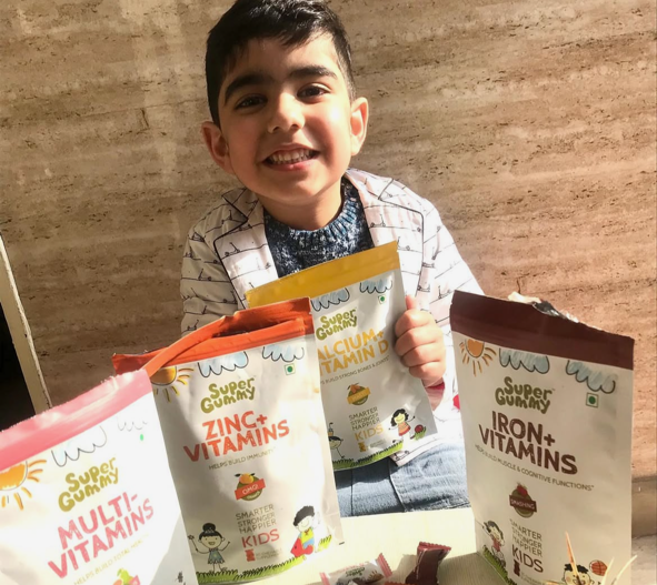
We brought the yummy and nutritious Super Gummy to life — a fun, flavour-packed daily multivitamin designed especially for kids. The three-year project gave us the opportunity to create a vibrant, kid-friendly brand world that parents trust and children love.
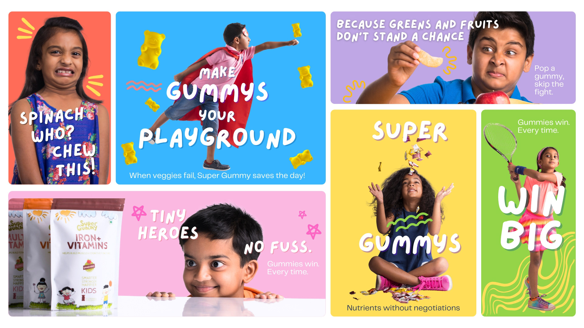
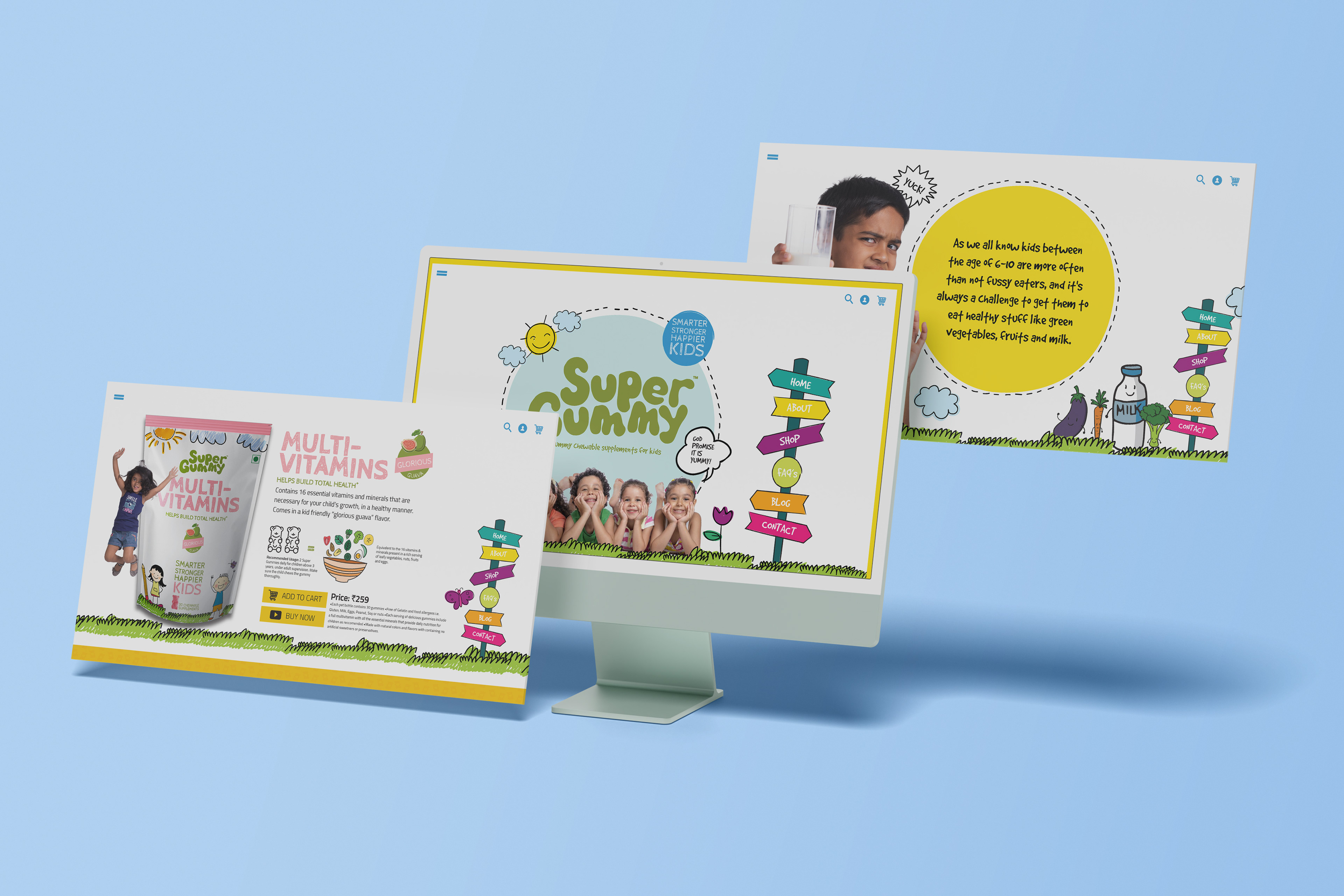
The project included brand identity development, packaging of five variants with unique flavour and function, determining a colour palette that would stand out on shelves but feel at home in lunchboxes, snackable content, POPs and both ATL and BTL assets tailored for the urban parent, unfolding as a pan-India metro launch campaign.
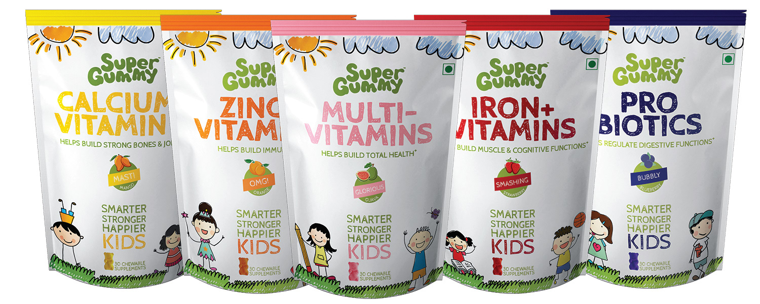

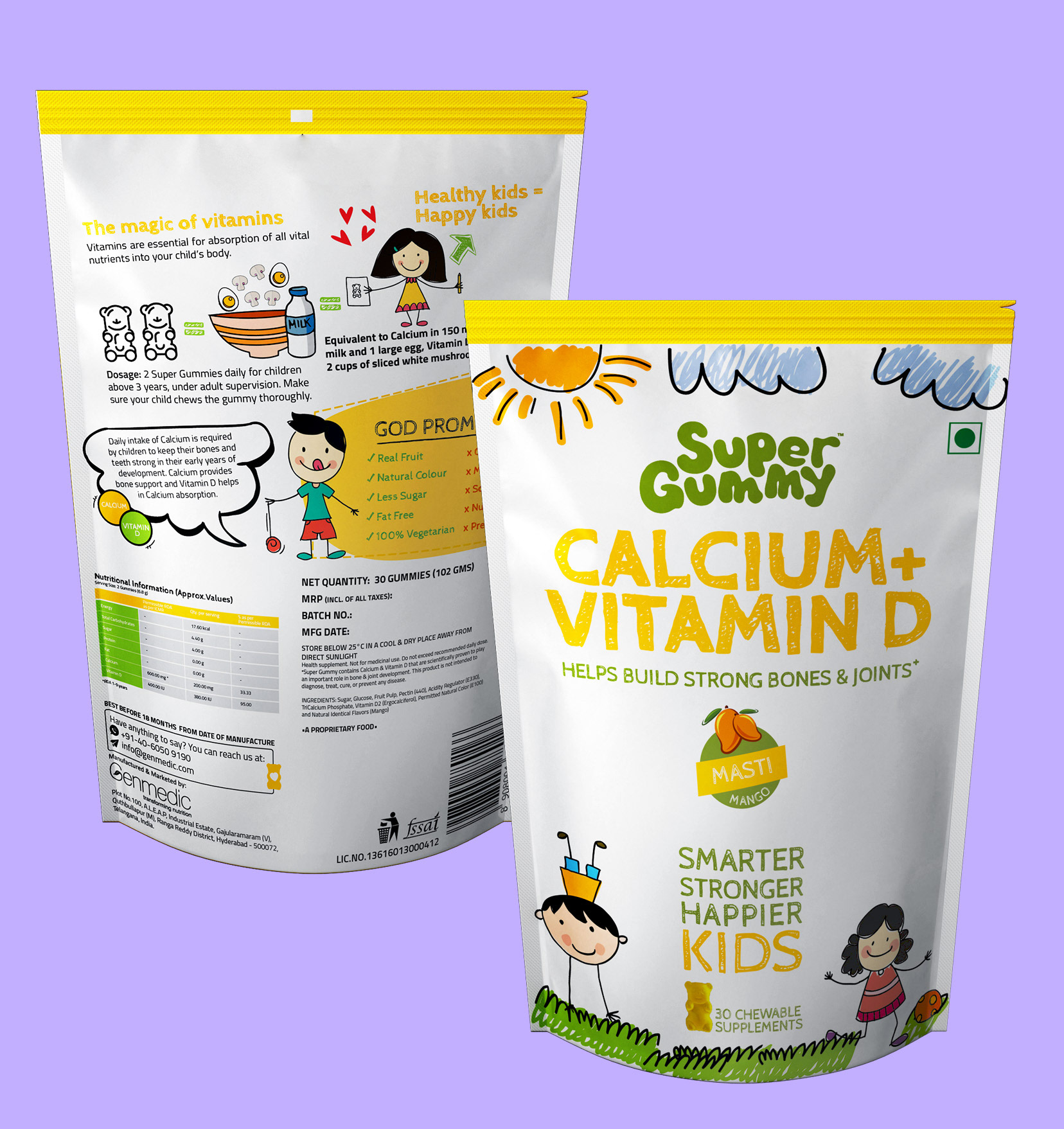
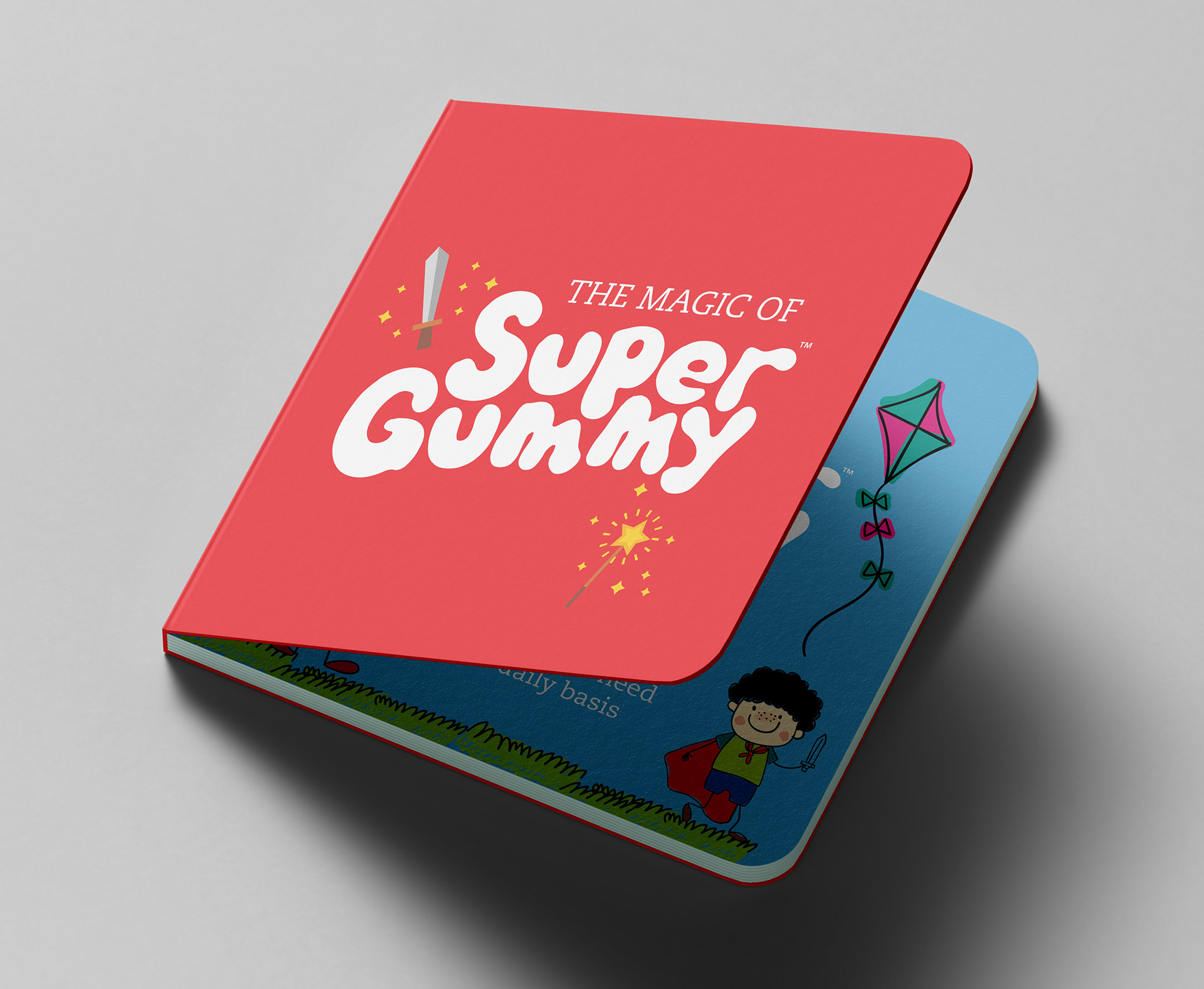
The Super Gummy logo evolved as a playful, rounded typeface in a fresh green color, evoking health, energy, and childlike fun. The tagline “Yummy chewable supplements for kids” reinforcing its appeal to parents seeking nutritious solutions in a friendly, accessible tone.
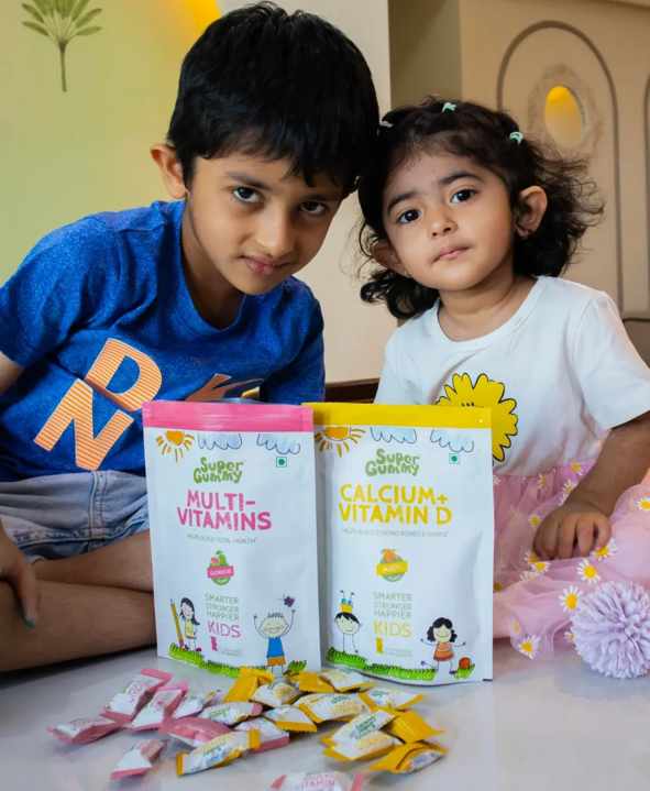


The Super Gummy kid is curious, joyful, and always eager to explore new things without hesitation. Our primary aim was to create engagement that was hands-on, encouraging kids to interact, learn, and confidently try something new through memorable micro-moments where kids feel excitement and wonder.

We brought the brand to life with playful, hand-drawn doodles that reflect the imagination and curiosity of kids — adding a layer of whimsy, energy, and fun across all creatives.

Client: Genmedic Healthcare Pvt Ltd, Hyderabad