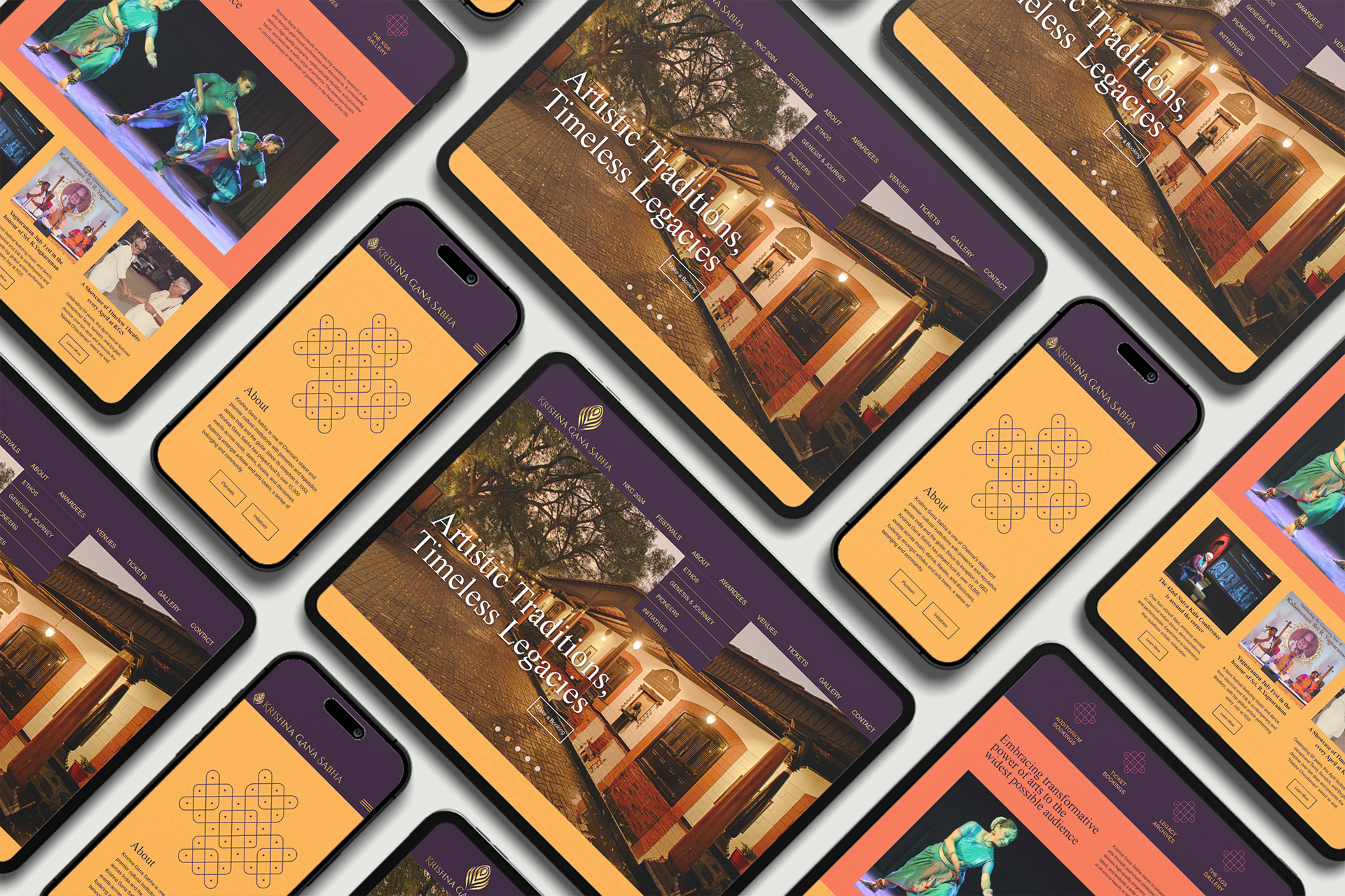
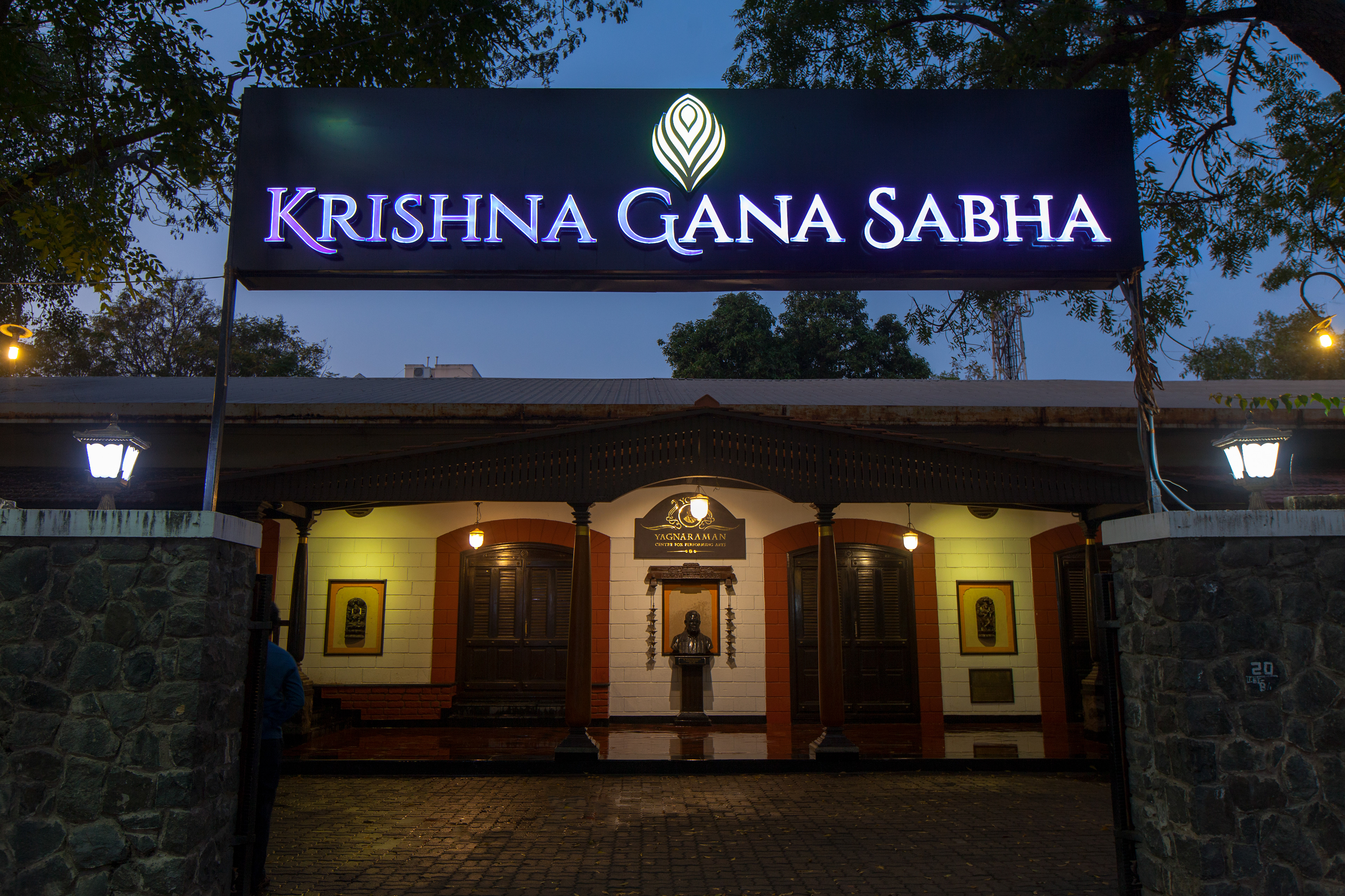
We were asked to reimagine the Krishna Gana Sabha's brand mark and website. The institution carries decades of culture and tradition in the heart of Chennai, and we were asked to evolve a clean design language anchored in flowing curves and a traditional colour palette, echoing the Sabha’s classical roots.
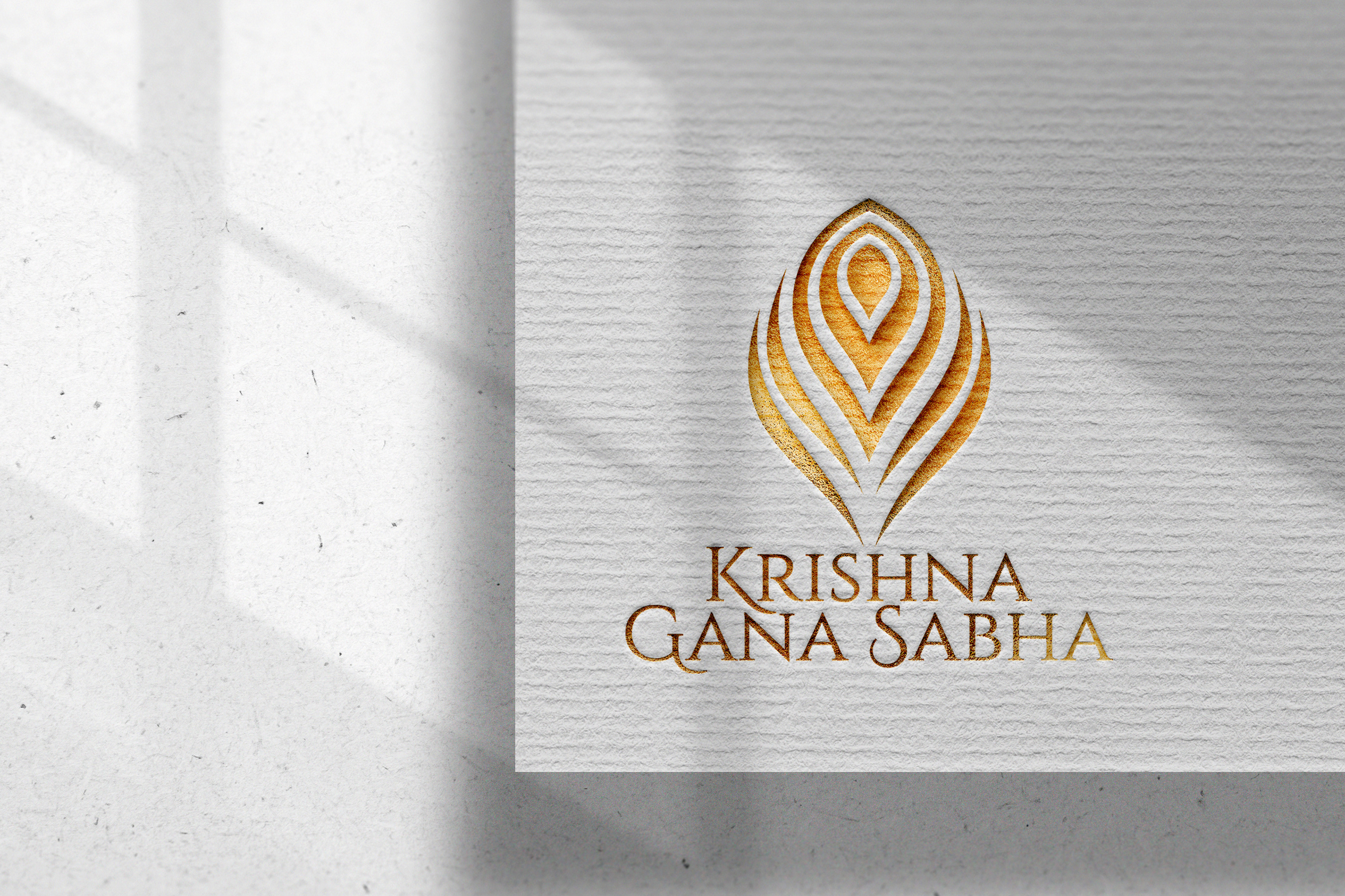
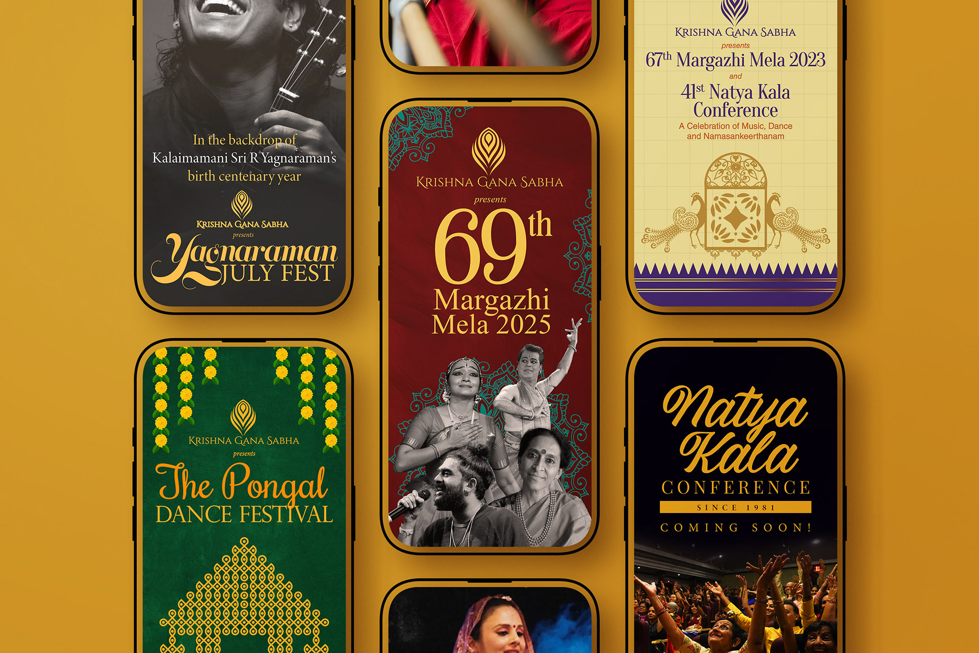
At the centre of the brand identity, the new KGS logo is simple and flowing and builds on the brand’s clear heritage of classical roots. The visual identity was kept nimble and flowing, evoking the rhythm of performance. Compact and contemporary, the new system speaks clearly to today’s evolving audience while honouring the past.
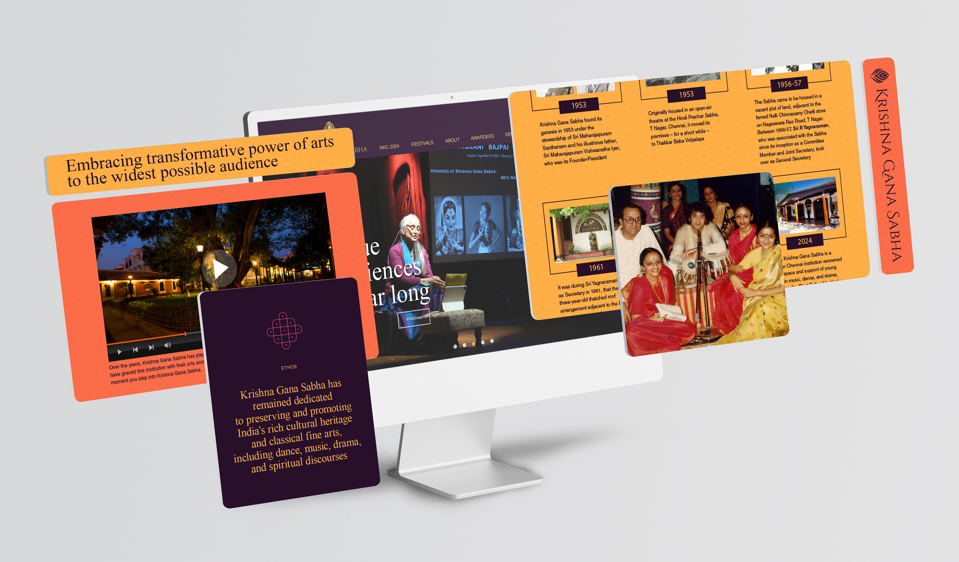
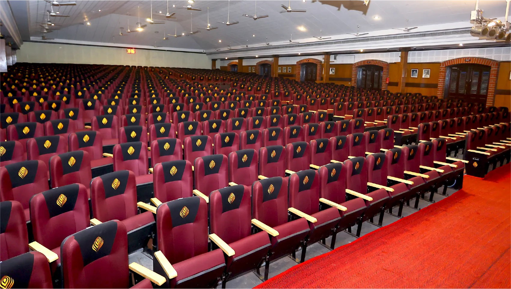
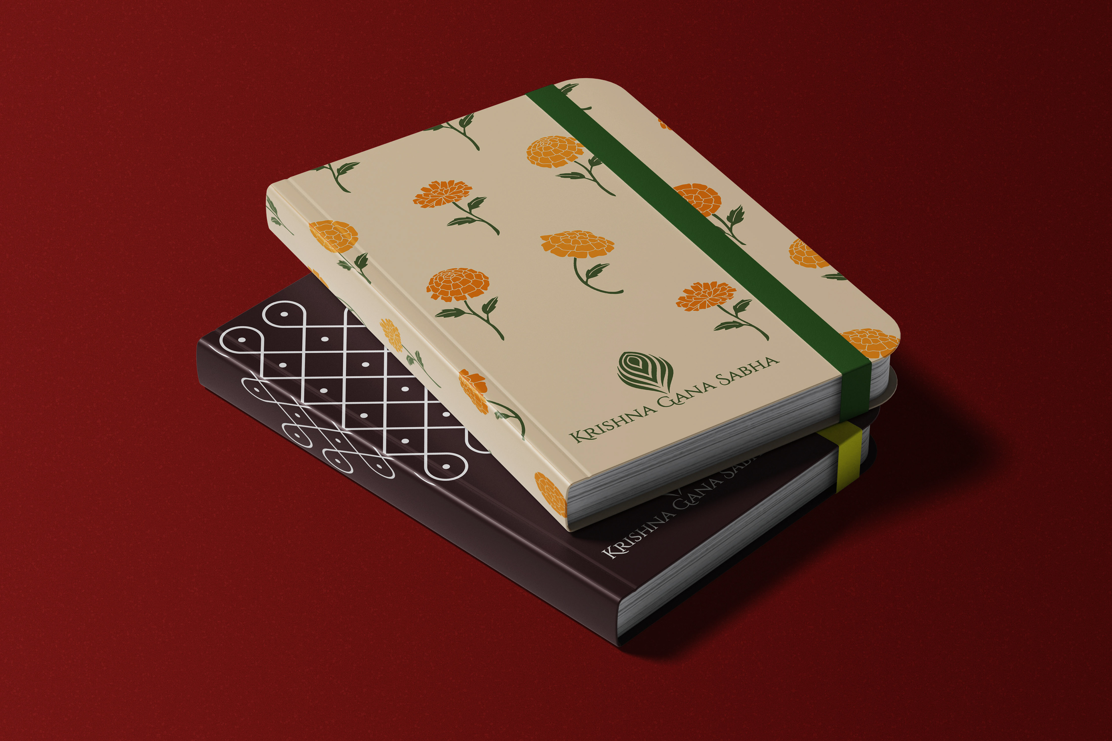
We also develop cohesive on-ground and digital presence for the client, extending beyond the website to their marquee events across platforms throughout the year. The visual language is rooted in tradition yet expressed through a minimalist lens, drawing inspiration from Indian textiles and motifs.
Client: Krishna Gana Sabha